Want your phone and laptop to match your summer travel vibe—without spending hours scrolling? This guide walks you through choosing Memorial Day wallpaper ideas that feel seasonal, travel-forward, and practical, so your screens stay inspiring and useful from long weekend planning to airport days.
Step 1: Pick a “Summer Travel Aesthetic” Theme That Matches Your Trip Style
What to do: Choose one clear theme for your Memorial Day wallpaper set before you start downloading or designing. Keep it tied to how you’ll actually travel over the next 4–8 weeks (road trips, beach weekends, national parks, city breaks, or flights).
Why it matters: A specific theme makes your wallpaper look cohesive across devices, helps you pick colors that work with your app icons, and prevents you from saving 30 images you’ll never use. It also sets the tone for trip planning—your screens become a visual “north star” for the season.
Specific example: If you’re doing a long weekend beach trip plus a June road trip, choose a “Coastal Road Weekend” theme: sun-faded blues, sandy neutrals, subtle map textures, and small travel icons (a tiny car, a shell, a sun). Your lock screen could be a minimal beach sunrise with the date “Memorial Day Weekend,” and your home screen could be a muted map-style gradient that keeps icons readable.
Mistake to avoid: Don’t mix high-contrast patriotic graphics with random neon summer quotes. It can look chaotic fast—and busy wallpapers make it harder to spot travel apps when you’re navigating, checking boarding passes, or pulling up reservations in a hurry.
Step 2: Choose the Right Wallpaper Types for Lock Screen vs. Home Screen (and Add Useful Travel Info)
What to do: Plan two different wallpapers: one designed for quick-glance info (lock screen) and one designed for usability (home screen). For Memorial Day + summer travel, the lock screen is perfect for a subtle seasonal message and a practical reminder; the home screen should be calmer so your icons and widgets stay easy to read.
Why it matters: The lock screen is what you see most when you’re on the move—at a gas station, in TSA lines, or when you’re double-checking the time. A lock screen that’s too busy can make notifications hard to scan. A home screen with heavy patterns makes it harder to find maps, airline apps, and booking confirmations quickly.
Specific example: Create a lock screen that includes a minimal “MDW” or “Memorial Day Weekend” text line and one travel-ready detail: “Leave by 7:00 AM” or “Pack: ID + charger.” Keep the text near the top or bottom so it doesn’t collide with the time. Then set a home screen wallpaper that’s a soft gradient in beachy colors (foggy blue to warm sand) so your app grid stays legible. If you use widgets, keep the wallpaper even more minimal.
Mistake to avoid: Avoid placing important text where the clock or widgets will cover it. Before you commit, test the wallpaper on your actual device and check it with notifications turned on. What looks perfect in a preview can be unreadable once the UI overlays appear.
Step 3: Build a Memorial Day Color Palette That Photographs Well (and Feels Travel-Realistic)
What to do: Choose a color palette that nods to Memorial Day without going full flag. Start with 3 core colors and 1 accent, then apply them consistently across your wallpapers, packing list notes, and any trip-planning screenshots you might save.
Why it matters: A palette that’s too saturated can feel harsh on screens, clash with app icons, and make your phone look “loud.” Travel aesthetics work best when they feel lived-in: sun-washed, airy, and easy on the eyes. A smart palette also makes it simpler to create matching wallpapers for multiple trips (lake weekend now, city getaway later) without starting from scratch.
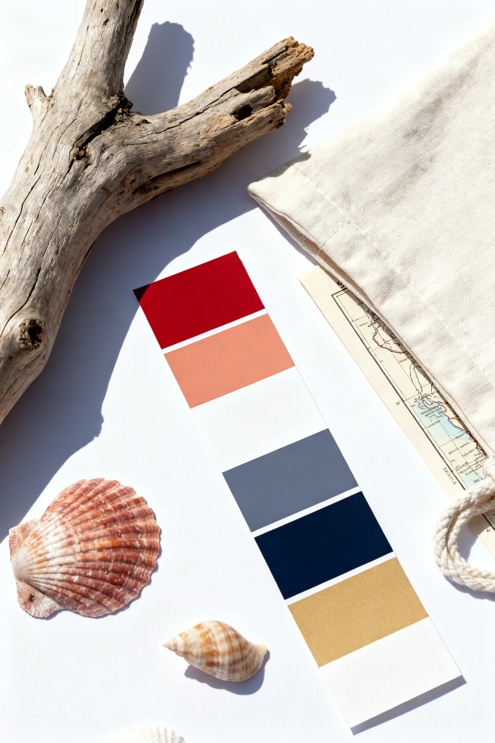
Specific example: Try a “Modern Memorial Day Coastal” palette:
- Core 1: Navy (for a classic travel feel—think evening boardwalk or a denim jacket)
- Core 2: Warm white (like beach sand or a bright hotel sheet)
- Core 3: Faded red/coral (more sunset than flag)
- Accent: Sea glass green (for a fresh summer detail)
Use navy + warm white for the home screen gradient, and add a tiny coral accent line or small star icon on the lock screen. The result reads “Memorial Day weekend,” but still looks like summer travel, not a holiday poster.
Mistake to avoid: Don’t rely on pure red (#FF0000) and pure blue (#0000FF). They can look overly intense and cheap on many screens. Slightly muted tones look more premium and more “summer road trip” than “graphic banner.”
Step 4: Source or Create High-Quality Travel Imagery (and Format It Correctly for Your Devices)
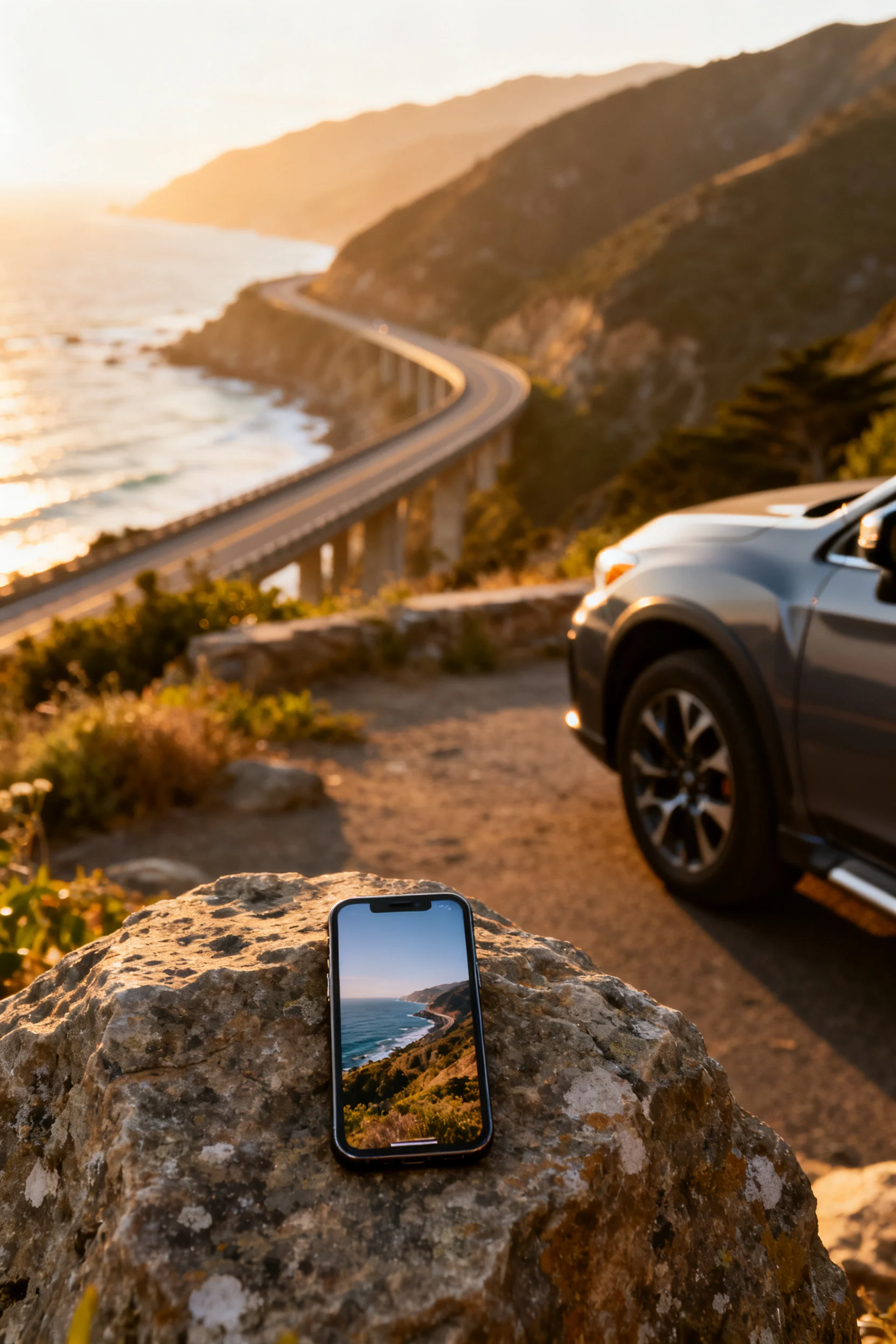
What to do: Use high-resolution images and format them for your exact screen sizes. Decide whether you want (a) real travel photos you took, (b) stock-style travel scenes, or (c) simple illustrated graphics (maps, icons, patterns). Then crop with the clock and icons in mind.
Why it matters: Blurry wallpapers feel instantly low-effort, and poor cropping can cut off horizons, faces, or key details. Correct formatting also prevents weird zooming, pixelation, or text being hidden behind widgets—especially important if you’re adding trip reminders to your lock screen.
Specific example: For a first-timer planning a Memorial Day road trip, use one of your own photos: a dashboard view, a roadside wildflower field, or a beach parking lot sunrise. Crop it vertically with negative space at the top (for the time) and a clean area in the middle (for notification readability). Then make a matching home screen version by applying a soft blur to the same photo so it becomes an icon-friendly background. If you’re using a map-style wallpaper, center the “route line” lower on the screen so it doesn’t fight the clock.
Mistake to avoid: Don’t screenshot low-res images and call it done. Screenshots often compress detail, and text overlays get fuzzy. If you’re downloading a wallpaper, save the original file, not a preview image. If you’re using your own photo, start with the original camera file and edit from there.
Quick Checklist
- Choose one summer travel theme (beach weekend, national parks, city escape, road trip, etc.).
- Create two wallpapers: lock screen (informative) + home screen (minimal for icons).
- Pick a 3+1 color palette (3 core colors + 1 accent) with slightly muted tones.
- Test readability: check time, widgets, and notifications against the wallpaper.
- Use high-resolution images; avoid compressed screenshots and low-quality previews.
- Crop with negative space where your clock and widgets sit.
- Keep one “travel reminder” on the lock screen (departure time, packing note, or budget cue).
- Save a matching set for multiple devices (phone + laptop) to keep the aesthetic consistent.
FAQ
What makes a wallpaper feel like “summer travel” instead of just “summer”?
Summer travel wallpapers include visual cues of movement and planning—roads, maps, coastlines, ticket-shaped graphics, luggage tags, sunsets shot from a car window, or minimal itinerary text. Regular summer wallpapers lean more generic (fruit, bright florals, random quotes) without a sense of place or motion.
How do I keep my Memorial Day wallpaper patriotic without it looking too bold?
Use subtle references: muted navy and warm white with a coral accent, a small star detail, or a minimal “MDW” label. Avoid large flags, high-contrast stripes, or bright primary colors if you want a modern travel aesthetic.
Should I use words or quotes on my lock screen?
Yes—if it’s short and functional. A tiny “Memorial Day Weekend” or a practical line like “Leave by 7:00 AM” works better than a long quote. Keep text away from the clock area and test it with notifications so it stays readable.
What’s the easiest way to make my home screen look clean for travel days?
Use a soft gradient or a lightly blurred travel photo with plenty of empty space. The goal is fast app access when you’re navigating, checking reservations, or pulling up a boarding pass. Minimal backgrounds reduce visual clutter and help you find apps quickly.
How often should I update my wallpapers during summer trips?
A good rhythm is: one Memorial Day weekend set, one early-summer set (June), and one mid-summer set (late July/August). If you’re taking multiple trips, update your lock screen to match the next departure (date or reminder), but keep a consistent home screen palette so your phone stays familiar and easy to use.